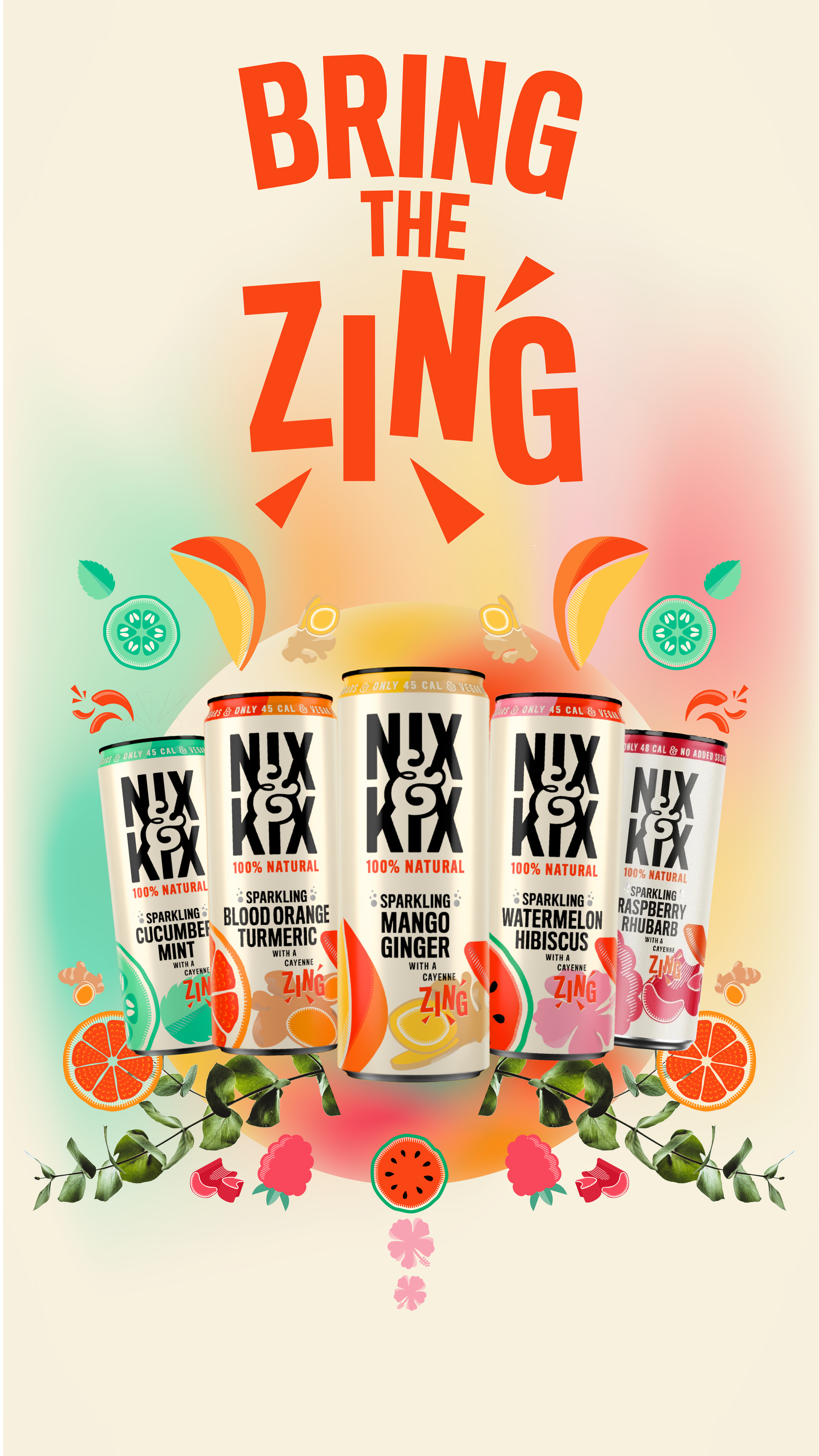
Nix & Kix is an all natural, full flavoured soft drink. It is refreshing with interesting flavours like Watermelon & Hibiscus and Blood Orange & Tumeric to name a few, all infused with a hint of Cayenne ZING. They wanted a new design platform that could communicate what their brand is about in seconds.

We therefore needed to find a way to communicate to the consumer the Zing element which really sets them apart in the category (and with that the great taste of the product).
We interpreted the word “Zing” in a multi-faceted way.
It could mean Zing in flavour, Zing as an afternoon pick-me-up or Zing as a challenge. Hence landing the line “Bring the Zing!”.
So I came up with a design that would imply a “bursting full of flavour” by playing with the size of moveable assets and incorporating a sense of symmetry to match their branding. With limited resources, we utilised their existing illustrations to pull it back into their brand world combined with photography. The key design element here is the use of their brand colours. We created this fluid gradient background to imitate the liquid, and colours matching the cans to create a sense of what the ingredients are. Ultimately, it created a burst of all the feels. What we feel was great about approaching it in this way was how interchangeable the designs are. Change out the photography for different occasions. Move pieces around to fit a format. The organic nature of the design means that it can be used in many different ways.
We also had to come up with a range of assets that could live as 6S, 48S, Digital, Banners, Grocery shelf wobblers and strips and a whole bunch of other formats. Coming up with a design that could be malleable to fit various sizes and formats, which worked perfectly with this concept.


Agency: Red Brick Road
Creative Director: Richard Megson
Art Direction / Design: Nathalie Théry
Copywriter: Brian Turner


